Transformation Through Time: From a Viral Capsule to a Dividing Cell
For Biosan, 2025 marks a new chapter in our journey — the introduction of a refreshed identity. As with life, psychology, technology, and business, everything evolves — and so do we. Our visual identity must reflect who we are today: a living, developing, and adaptive organism.
We have entered a new stage: our cell is dividing — symbolizing growth, transformation, and vitality. This new identity captures that process — a transition from static stability to dynamic movement.
1992: Our Origins
The first Biosan visual mark, introduced in 1992, consisted of the word “BioSan” in deep blue. This logo reflected our early beginnings in the biotechnology field and remained in use until 1995.
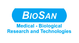
1995–2010: Stability Within the Frame
In 1995, the logo evolved into the “BioSan” name inside a blue rectangle with rounded corners. This version conveyed visual stability and quickly became a familiar symbol to our clients and partners. The accompanying slogan — Medical-biological research and technologies — clearly defined our sector. This design was used until the end of 2010.
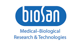
2011: Design Evolution
With the launch of the Bioform equipment design concept, our visual identity was updated using a calligraphic script. A vertical element represented stability and continuity, while an elliptical frame conveyed resilience and openness — a shape that “breathes” and adapts to its environment.
Biosan introduced a new logo symbolizing a living cell, where energy enters through the letter “b” and leaves the system, providing the power for development.
Our trusted blue color and industry-defining slogan remained unchanged, preserving brand consistency while adding a sense of refinement and modernity.
2025: A Dividing Cell - Growth and New Purpose
Today, Biosan is entering a more advanced and purposeful stage of development. With the transition to a new ISO standard and a deeper focus on medical diagnostics, our new identity represents a forward-looking shift. The logo now represents a living cell in the process of division — a metaphor for expansion, adaptability, and a thriving ecosystem.
This evolution reflects our commitment to:
Dynamic growth, visible in our expanding technologies and global partnerships;
Biological vitality, emphasizing our deep connection to life sciences;
Purposeful development, aligned with the evolving needs of the medical community.
Our Updated Color System: Calm, Clean, Connected
With this transformation comes an updated color identity, designed to visually represent Biosan’s values and direction today.
Reflecting the essence of this moment, Biosan introduces the evolution of its logo and visual language. The new identity features:
“Laboratory blue” - a continuation of our legacy, symbolizing scientific precision, stability, and trust;
“Medical green” - representing sustainability, sterility, and our close relationship with the medical field;
A renewed font for “biosan” - honoring and respecting our history and roots.
Together, the updated palette conveys:
Purity and calmness, aligned with laboratory and clinical standards;
Stability and balance, essential for innovation in life sciences;
Clarity and evolution, in the way we communicate and serve.
More Than a Visual — A Living Identity
Our new identity is more than a change in design. It is a reflection of who we are becoming: a company that grows like a living system - adaptive, responsive, and committed to supporting health and science across borders.
We believe this transformation will be embraced with enthusiasm — by our partners, our clients, and the global scientific community that has trusted us for over three decades.