For Biosan the New Year has started with reaching an important milestone in company's history — the logotype change. Life, psychology of human and business, technology and processes - everything undergoes changes. We also undergo changes. These changes affect company’s image, it should meet the needs of the moment.
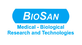
Evolution of „BioSan” logotypes
There were several logical stages of logotype development in the history of the company. In the very beginning in 1992 the first logotype was composed of the word „Biosan” in deep blue colour. In such appearance it was used up to 1995, when a new version of the logo was elaborated consisting of the word „BioSan” enclosed into a blue box with rounded edges. We and our customers got used to this look of the logo, which existed up to the end of the year 2010.

The slogan Medical-biological research and technologies was an essential and complementary element of the logo, indicating the market segment of our company.
Why do we update the logotype
The case is that during 19 years of its history company „Biosan” has not merely grown, it has radically changed. At present it is an absolutely new company with international shareholders, having highly experienced professional staff. Its products are known and are held in high repute of reliable laboratory equipment in more than 70 countries. It is evident that many people in Latvia and abroad perceive company „BioSan” as a symbol of an efficient enterprise, focused on needs of its customers, independently developing and avoiding dully replication of commercially available products.
What is the message of the new logotype?

Obviously, it is not easy to objectify the main qualities of the company in a graphic form. Let us enumerate the main ideas, which we intend to reflect in the new logotype:
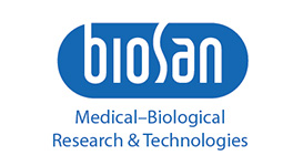
Motivation. The updated logotype intends to reflect the company’s aspiration towards dynamic changes. In the same time the new logotype maintains similarity with the previous logo: our slogan Medical-biological research and Technologies remained unchanged since it is an identifier of our industry sector.
Personality, innovation. This property reflects success of our product line of personal mini-laboratories, in the same time it underlies the individual attitude towards customers needs. It is a kind of our decision-making strategy, tailored for a particular customer. These qualities are reflected by using original calligraphic script of exquisite style.
Modern design, elegance. Development of our equipment within a framework of design conception «Bioform» has stimulated us to elaborate a new writing of our logotype, which is inviting to the eye and in the same time stylish and even fashionable. In our opinion the new logotype is stylish and modern.
Stability, reliability, continuity. The new logotype has a vertical element, symbolising stability and reliability of the company. An ellipse around the logo is an ideal sphere, which restrains pressure of external environment much more efficiently than the previous logotype. Presence of open spaces in the key letters B and S extended towards the ambient environment indicates the specific selected openness and direct link with the environment – it allows breathing of our logo.
Although we have kept the external blue box, the logo may be used also without it. Continuity is represented by our traditional blue colour as well as by the slogan Medical-biological research and technologies not extended beyond frames of the new logo.
We believe that restyling of „Biosan” will be accepted with enthusiasm.


